More Than a Logo
After four decades of growth, transformation and innovation, Property Tectonics has unveiled a new visual identity that does more than simply display a name. It tells a story.

19th October 2026
Esther Brady - BSc(Hons)
After four decades of growth, transformation and innovation, Property Tectonics has unveiled a new visual identity that does more than simply display a name. It tells a story.
For much of our forty-year history, our logo served a practical purpose. It was recognisable, dependable and functional. Yet like many organisations that have evolved significantly over time, there came a point when a single flat image could no longer fully represent the richness of our journey. The business that exists today is not the same business that began forty years ago, and our brand needed to reflect that reality.
Our new identity does exactly that.
Since our foundation, Property Tectonics has continually adapted to the changing demands of the property, asset management and consultancy sectors. What began as a focused professional services business has evolved into a multi-disciplinary organisation, combining technical expertise, strategic consultancy and innovative software solutions.
Over four decades, we have welcomed new people, embraced new technologies, expanded our services and developed entirely new areas of expertise. Each chapter has added a layer to who we are today.
The challenge was how to capture that evolution in a single symbol.
The answer came not in creating something simpler, but in creating something more truthful.
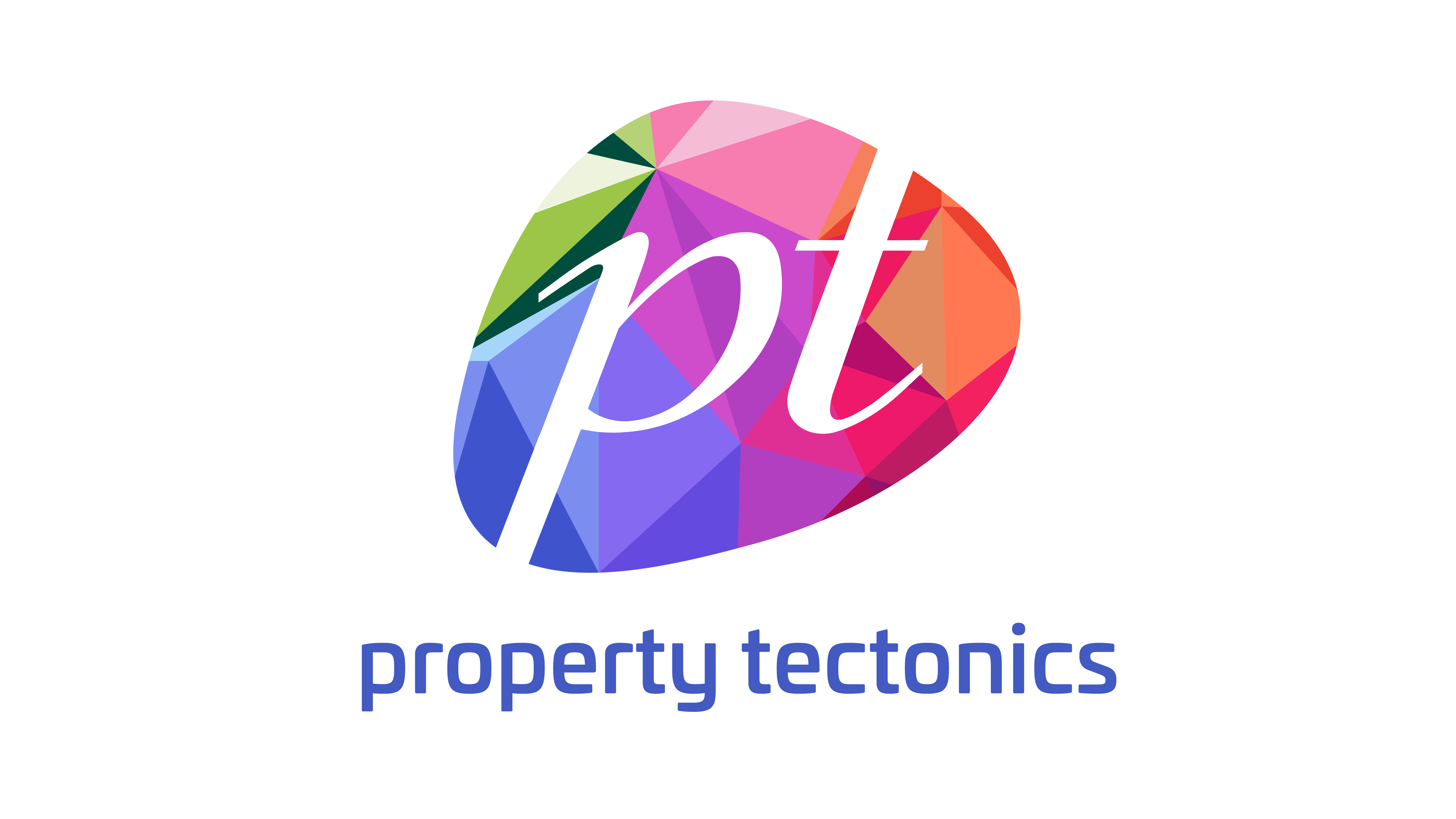
The new Property Tectonics logo is constructed from a series of coloured facets, forming a gemstone-like structure beneath the familiar pt mark.
The design deliberately avoids a single, uniform shape. Instead, it is made from many interconnected surfaces, reflecting the reality that organisations are shaped by thousands of decisions, experiences, achievements and people over time.
Each facet represents a part of our journey.
The colours embedded within the mark are not decorative choices. They are visual references to significant stages in our history:
· Green acknowledges the original identity under which Property Tectonics was founded and grew during its formative years.
· Magenta, pink and orange celebrate the emergence and success of our software and digital asset management platforms, which have developed their own reputation and recognition within the market.
· The colours that bridge these points represent the many transitions, expansions and reinventions that have taken place between those milestones.
Together, these facets create something greater than the sum of their parts, just as the business itself has been built over forty years.
Capturing Movement and Growth
Unlike a traditional flat logo that presents the same image from every angle, a faceted gemstone creates the impression of movement. Light interacts with each surface differently, revealing new dimensions depending on perspective.
This characteristic became a powerful metaphor for Property Tectonics.
Throughout our history, we have not remained static. We have evolved alongside our clients, our markets and the industries we serve. Every new challenge, innovation and opportunity has shaped the business in a different way.
The faceted design reflects this ongoing journey. It embodies growth, adaptability and resilience while acknowledging that progress is rarely linear.
While the coloured gemstone tells the story of change, the white pt positioned across the centre represents continuity.
Amid four decades of transformation, certain principles have remained consistent:
· A commitment to technical excellence.
· A focus on helping customers make informed decisions.
· A culture built around expertise, integrity and innovation.
· A dedication to delivering lasting value.
The pt serves as a visual anchor, providing clarity and recognition while the facets around it illustrate the many paths that have brought us to this point.
This new brand identity is not simply a celebration of what Property Tectonics has achieved over the last forty years. It is a marker of what comes next. The integration of consultancy, technology and digital solutions continues to shape our future, and our visual identity now reflects that ambition.
Forty years cannot be captured in a single colour, a single shape or a single sentence.
But they can be captured in a collection of facets, brought together to form something enduring, distinctive and unmistakably Property Tectonics.
Founded with Purpose. Built with Heart and Soul.
Property Tectonics: Forty Years in the Making.